
Hopkins & Wayson Rebrand & Video Mailer
Hopkins & Wayson is a general contractor based in Owings, Maryland, with 90 years of work behind it. The company builds commercial and retail projects across the Mid-Atlantic for national brands like Wawa, Royal Farms, 7-Eleven, ALDI, Chick-fil-A and Taco Bell. Its approach hasn’t changed much since Morgan Wayson, Jr. put it into words in 1963: deliver a finished product in the least amount of time and at the lowest possible cost, without giving up safety or quality.
Hopkins & Wayson had decades of reputation behind it, but its logo didn’t show it. The company was working from a low-quality image file that didn’t hold up on signage, print or digital, and there were no rules for how the brand should look from one place to the next. As the company started expanding into new regions, that inconsistency got harder to ignore.
AR partnered with GC Strategies on a brand refresh. GC Strategies built the messaging framework: mission, values, voice and key differentiators. AR handled the visual side with the guide to outline the brand.
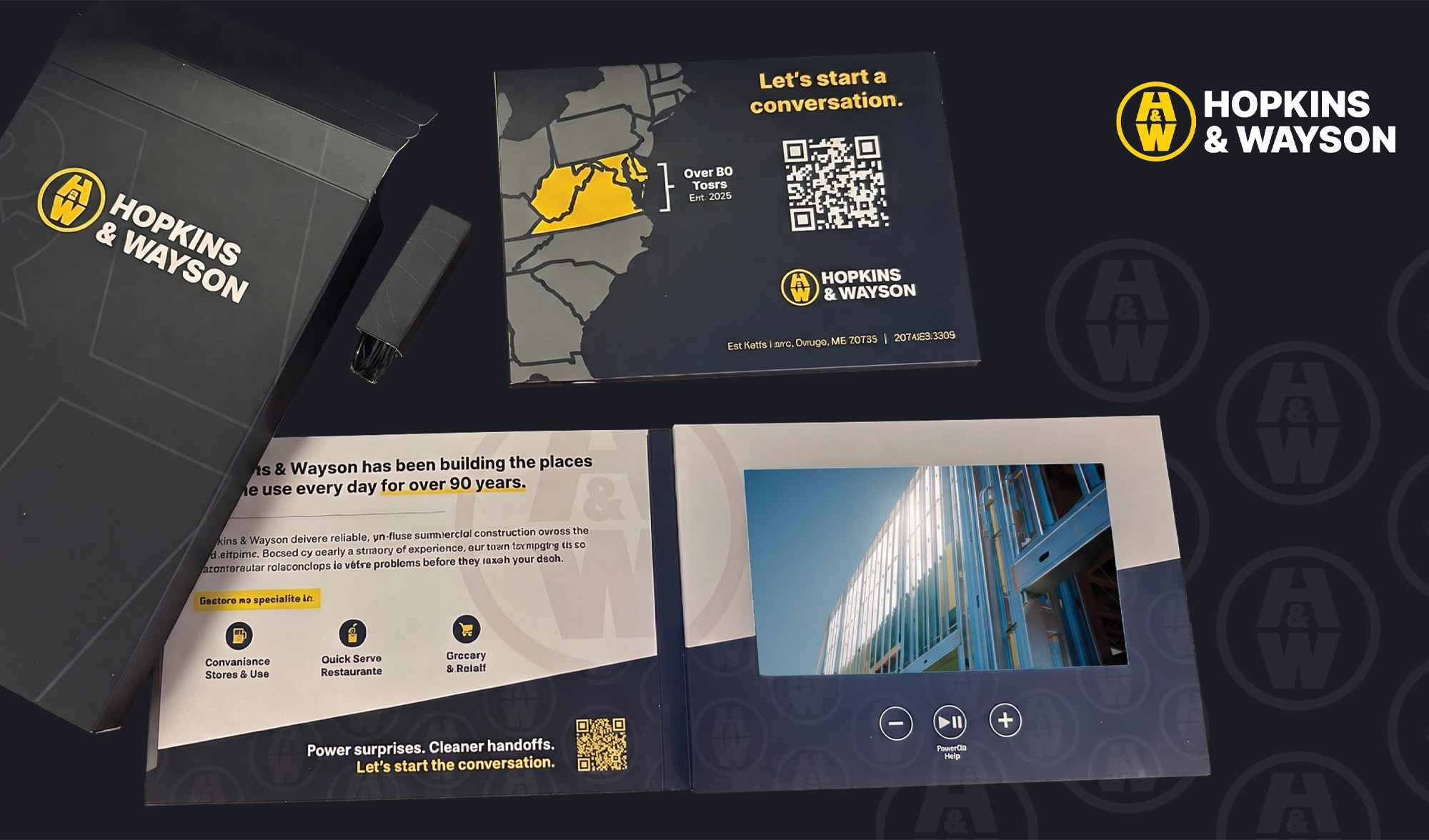
We started by rebuilding the logo from scratch into a clean, balanced mark. Then we built a full system around it: horizontal and stacked versions, versions with and without the “General Contractors” tagline, a standalone icon for favicons and other small uses, and single-color versions in yellow, black and white. We also set clear-space rules so the logo works on a white page or on top of a jobsite photo.
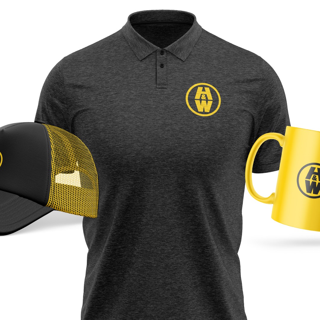
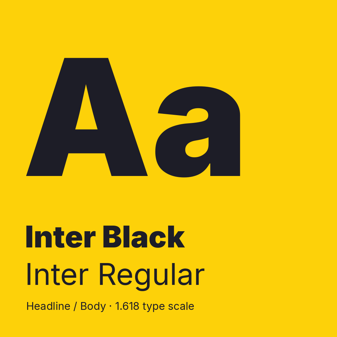
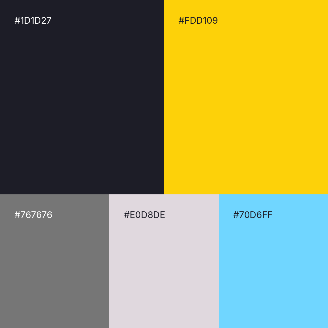
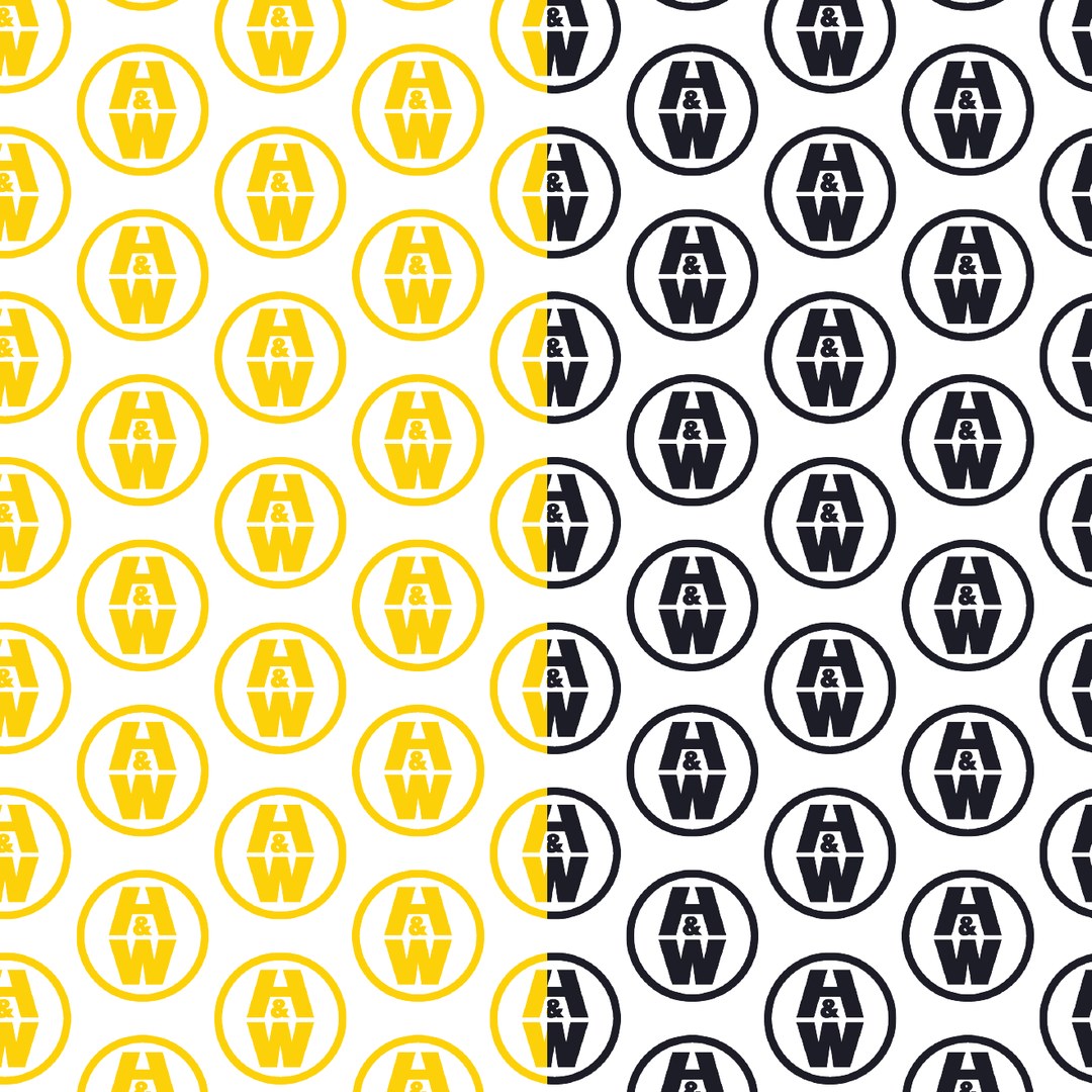
From there we defined a color palette led by black and yellow, chose Inter as the primary typeface with a simple sizing method anyone on their team can follow, and created brand patterns, photo overlay examples, social media headers and profile images, business cards, letterhead and apparel guidelines.
The final step was pulling it all together. We combined GC Strategies’ messaging with our visual standards into one brand guide, so Hopkins & Wayson’s staff and outside vendors have a single reference for how the brand should look and sound as the company grows.
- Replaced one low-resolution logo file with a complete logo system: six variations covering horizontal, stacked, tagline and icon versions.
- Defined a core color palette with HEX, RGB, CMYK, HSB and LAB values for every color, so print and digital match.
- Set typography standards with a repeatable sizing and leading method built on a single font family.
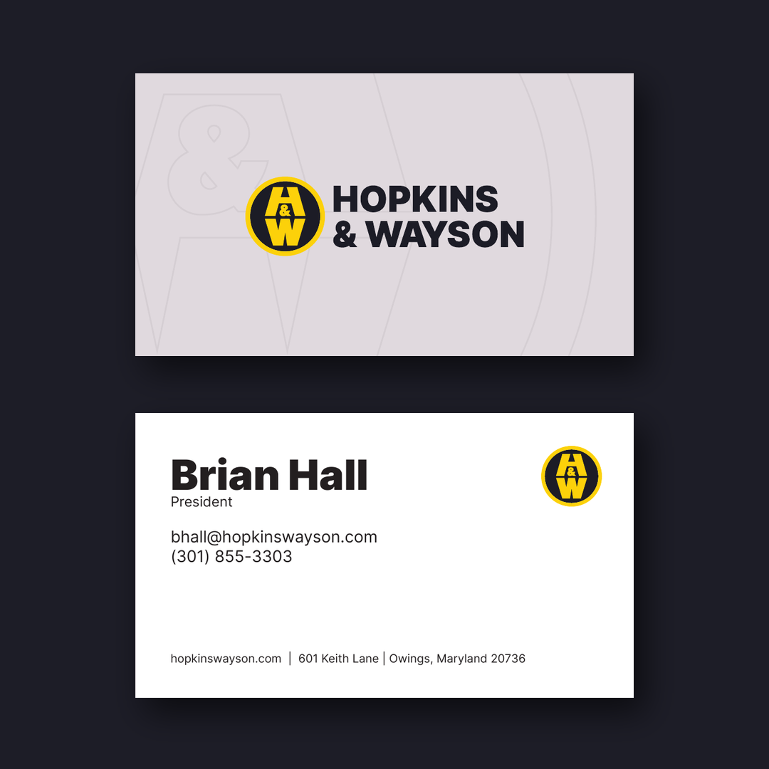
- Delivered ready-to-use applications, including social headers and profile images, business cards, letterhead, apparel and merchandise.
- Combined the work of two agencies into one brand guide the client can hand to any designer or vendor.
A brand refresh is only as good as the rules that come with it. A new logo helps, but a documented system is what keeps a brand consistent once it leaves our hands. Working alongside a messaging partner also meant the visuals and the voice were built to support each other from the start. We can bring the same approach to any established company whose reputation has outgrown its look, especially one getting ready to expand.