Infographics: The Smart Way to Simplify Your Message
Getting my message across in today’s distraction-filled world was no walk in the park. I used to drown in endless spreadsheets of data, feeling overwhelmed and lost in a sea of numbers. Then I discovered infographics, and everything changed. They mix data with eye-catching visuals in a way that makes even the most complicated ideas easy to grasp and fun to share.

Why I Fell in Love with Infographics
Infographics have been a game-changer for me. They take all that messy, complex information and turn it into visuals that just click. Whether I need to explain a process, highlight key stats, or simply share a story, these visuals help my message stick—almost like magic. And the best part? They work everywhere. Whether I’m posting on social media, shooting off an email, or even handing out printed brochures, infographics adapt seamlessly to any platform.
What I’ve Learned About Creating Impactful Infographics
- Keep It Simple
I realized that nobody wants to sift through a jumble of numbers or lengthy paragraphs. The goal is to make the information easy to digest. By focusing on just the key points and keeping the design clean, I’ve been able to make my message crystal clear.
- Tell a Story
- Infographics aren’t just a bunch of charts and icons—they’re about telling a story. I like to think of them as a visual journey that guides my audience through the information in a logical and engaging way. It’s not just data; it’s a narrative that resonates.
- Make It Versatile
- One of the coolest things I discovered is that infographics work like a charm on any platform. Whether it’s on social media, in an email newsletter, or as a printed piece, they maintain their impact. This versatility means I can connect with my audience wherever they are.
- Go Beyond the Stock Options
- Sure, it’s tempting to use pre-made images or templates, but I found that custom-designed infographics really make a difference. When the visuals are tailored to my brand, the message feels more personal and engaging, forging a deeper connection with my audience.
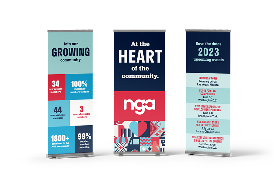
How Anderson-Robertson Marketing Made an Impact
Working with Anderson Robertson Marketing turned my infographic experience from “meh” to memorable. They took my overwhelming data and transformed it into vibrant, compelling visuals that truly tell my story. Suddenly, my once intimidating spreadsheets became conversations that sparked interest—and even a few “wow” reactions!
In Conclusion
Infographics are so much more than just pretty pictures. They’ve helped me turn complex ideas into clear, relatable stories that everyone can understand. With a blend of straightforward visuals, engaging narratives, and a touch of customization, my message now truly resonates.
If you’re ready to see your data transform from a confusing spreadsheet into a lively, conversation-starting piece, I wholeheartedly recommend giving infographics a try. And if you need a little extra help along the way, Anderson Robertson Marketing is the team you want by your side.