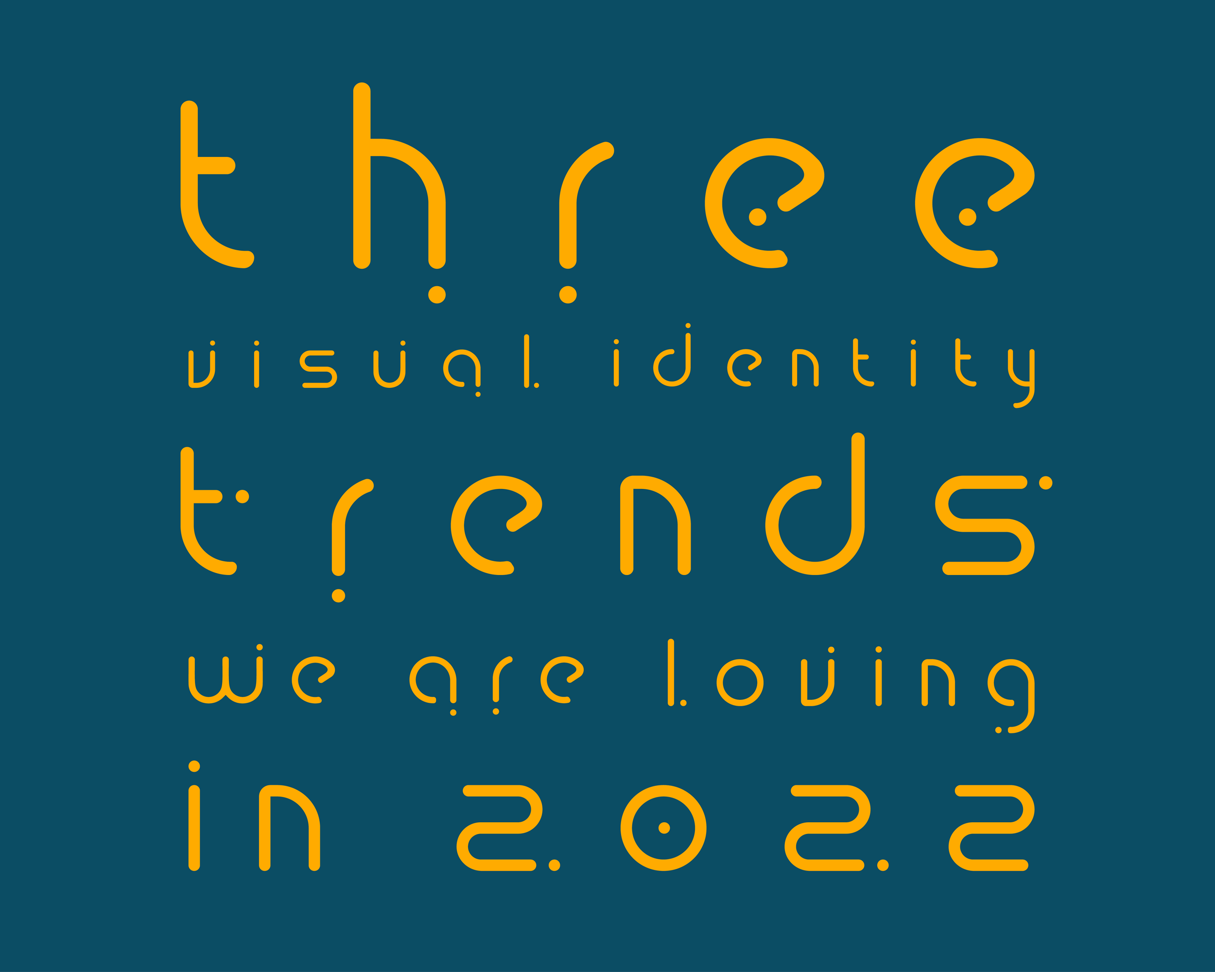
3 Visual Identity Design Trends We’re Loving in 2022
Visual Identity is what your customers see regarding your brand, product, or company. The visual identity is primarily made up of your logo, fonts, and colors. And just like people’s preferences, your visual identity may change over time to keep up with current trends and stay relevant.
As designers, our job is to keep up with design trends and see what works and what doesn’t for our clients. It’s important to keep evolving but not buy into every trend that comes our way. So, in 2022, here are the top three trends we’re loving right now!
1. Eco-friendly brands ditch the browns, greens, and trees
Eco-friendly messaging is becoming overwhelmingly saturated as companies jump on the sustainability bandwagon. While this isn’t a bad thing, the eco-friendly brands are getting lost in the mix. To stand out from the crowd, brands are reimagining their green and brown identity into more of a conceptual look and feel - they’re conveying their messages in quirky, more personalized ways.
How do you show how something is natural or sustainable without the trees, leaves, and raw textures? White space, minimal design elements, clean lines, and grid structure create an uncluttered aesthetic. By sticking to one focal point, your big idea will have a lot more impact. Consumers no longer look for brands that only talk about what they stand for - they look for brands that take action for what they believe in.

2. Disruptive type
Jumbled and full-of-character typefaces are in, and brands are experimenting with them more and more. It’s time to say goodbye to the old, plain typography and get crazy with it. While sleek is nice, clean, and readable - it can easily make you look stale or too corporate-y. You must find the balance between messy and digestible. Quirky trends like disruptive typography give brands the opportunity to demonstrate a more accessible, personal side of their brand.
You don't have to undergo a total rebrand either. By simply adding funky lines, edgy strokes, 3D elements, illustrations, or experimental color palettes to your brand fonts, you'll adapt to this unconventional trend. Trash the rulebook and utilize unexpected design elements like asymmetry, overlap, and hand-drawn details to show your individuality.

3. Illustration and hand-drawn design elements
In an increasingly digital world, how do brands retain their authenticity? By utilizing hand-lettering, other hand-drawn elements, and unpolished line drawings, your brand appears to be genuinely guided by real humans. This style suggests a charismatic and humble brand. Demonstrating how you’ve committed to the things you believe in has never been more important, and creating a sense of authenticity gives consumers the proof.
Taking advantage of this trend supports genuine brand storytelling and immersive brand experiences by welcoming audiences into your real world, inviting interaction, and building a connected and engaged community.

What design trends are you loving this year? Tell us in the comments!
